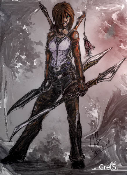
As I told a good friend of mine. I wish the art bug would not bite me into over drive at such ungodly hours.
I started this project at 10:30pm. Its now 3:00 am.
I think am going to marry my coffe machine when I get up at 9.
At any rate. This is my first attempt at using the Photoshop program. I mean really using it for once.
So I hope most of you will be kind to this backwards girl when she tells you that she is happy how this project turned out.
Definitely looks better than my first time! XD Looks awesome. Was this the picture you were referring to in your journal? If so, I want to know - what were they thinking?! Not enough fantasy/sci-fi elements... that's absurd. I've seen so many pictures on there of just a person in a cloak, and that seemed to be enough. Ah well. Weird, though. Makes me wonder.
Anyhoo... sorry about that. This is really lovely. I am really enjoying the costume and weapon designs.
--
~jamberry-song - words and whispers, the poet's eye on the universe. *jamberry - elves, knights and nature, the artist's half of the brain.
Yes, this was the picture I was referring to. No reason to be sorry. In fact, even though their reasons were valid I am still not so sure they were fair. After looking at my descriptions for my work , maybe I didn`t present it correctly. Oh well. Thanks for commenting. I really need to work on weapons. Weapons and men are weak points.
This was rejected...? Wow. I don't think I would have had a second thought looking at the weapons, but my definition of fantasy is much wider than some moderators - I swear some will claim humans can't exist in a fantasy setting, which is why I had to remove some of the TTG pages from my gallery there. >_<
Ranting aside, tis a wonderful start in Photoshop! Heck of a lot better than my first several attempts
I rather like the muted color scheme you've used, it fits the character well. You might try sharpening up some of the details (like in the wrinkles, and to help separate the armor on her arms from her dark pants) by using a near-black color to strengthen some of the linework. You might also be able to get cleaner linework by playing with the Levels tool (under Image > Adjustments)
--
Tales of the Travelling Gnome A fantasy webcomic brought to you by Matt Summers & Michelle Zastrow - [link]
Like I said its a first try. Actually I tried to cleanup the line work. Didn`t quite work. The line work of the original drawing was pretty jagged to begin with. I needed to really clean up the drawing it self and use the ink tool . Like you suggested, I needed more black in some areas. The armor on the arms are leather just like the chaps that are over her jeans. Besides using more black, I also could have lighten the chaps. Maybe. I kinda think the background could use some cleanup too .
Well...we live and learn.
Yes, this was rejected. Like I said before: My description didn`t prove this was moderen or punk fantasy. I also had to take down a few drawings on my gallery for the same reasons.
Daily Literature Deviations is a group that is dedicated to bringing literature to the forefront of the deviantArt community. We attempt to accomplish this by daily featuring Literature artists from around the community that deserve the recognition, but are not getting it.
Each day we will feature 10 deviations from the Literature categories in a News Article. In order to support the artists that we feature, we ask that you the news article as well as check out the individual pieces. We understand that each day you may not be able to check out each and every one of the pieces, everyone has their own things going on. We just ask that you make an attempt to help support the growing Literature community.
When it comes to community spirit, `Rushy is a shining example. From participating in devmeets, to providing positive encouragement to other artists, `Rushy can always be found demonstrating what it really takes to be a true deviant. It's without any hesitation that we are delighted to award the Deviousness Award for July 2009 to `RushyRead More
Devious Comments
Comments
Anyhoo... sorry about that. This is really lovely. I am really enjoying the costume and weapon designs.
--
~jamberry-song - words and whispers, the poet's eye on the universe.
*jamberry - elves, knights and nature, the artist's half of the brain.
Ranting aside, tis a wonderful start in Photoshop! Heck of a lot better than my first several attempts
I rather like the muted color scheme you've used, it fits the character well. You might try sharpening up some of the details (like in the wrinkles, and to help separate the armor on her arms from her dark pants) by using a near-black color to strengthen some of the linework. You might also be able to get cleaner linework by playing with the Levels tool (under Image > Adjustments)
--
Tales of the Travelling Gnome
A fantasy webcomic brought to you by Matt Summers & Michelle Zastrow - [link]
Sorry.
Like I said its a first try. Actually I tried to cleanup the line work. Didn`t quite work. The line work of the original drawing was pretty jagged to begin with. I needed to really clean up the drawing it self and use the ink tool . Like you suggested, I needed more black in some areas. The armor on the arms are leather just like the chaps that are over her jeans. Besides using more black, I also could have lighten the chaps. Maybe. I kinda think the background could use some cleanup too .
Well...we live and learn.
Yes, this was rejected. Like I said before: My description didn`t prove this was moderen or punk fantasy. I also had to take down a few drawings on my gallery for the same reasons.
--
There is no limit to a warped imagination
take a peak
So, think there will be a forth movie?
--
There is no limit to a warped imagination
take a peak
Its nice to have action heroine(actress) that can kick ass!
Dirty, rough, believeble ( in some areas) fighting.
--
There is no limit to a warped imagination
take a peak
Previous Page12Next Page